Applies to BTField version 15.3.38 and onward.
Overview
This page covers how BTField turns scattered survey data into the gridded image you see on the map, and how to control its appearance:
- the gridding method used to interpolate values onto the display grid,
- the colour palette applied to the gridded values, and
- the optional two‑zone threshold that de‑emphasises low values.
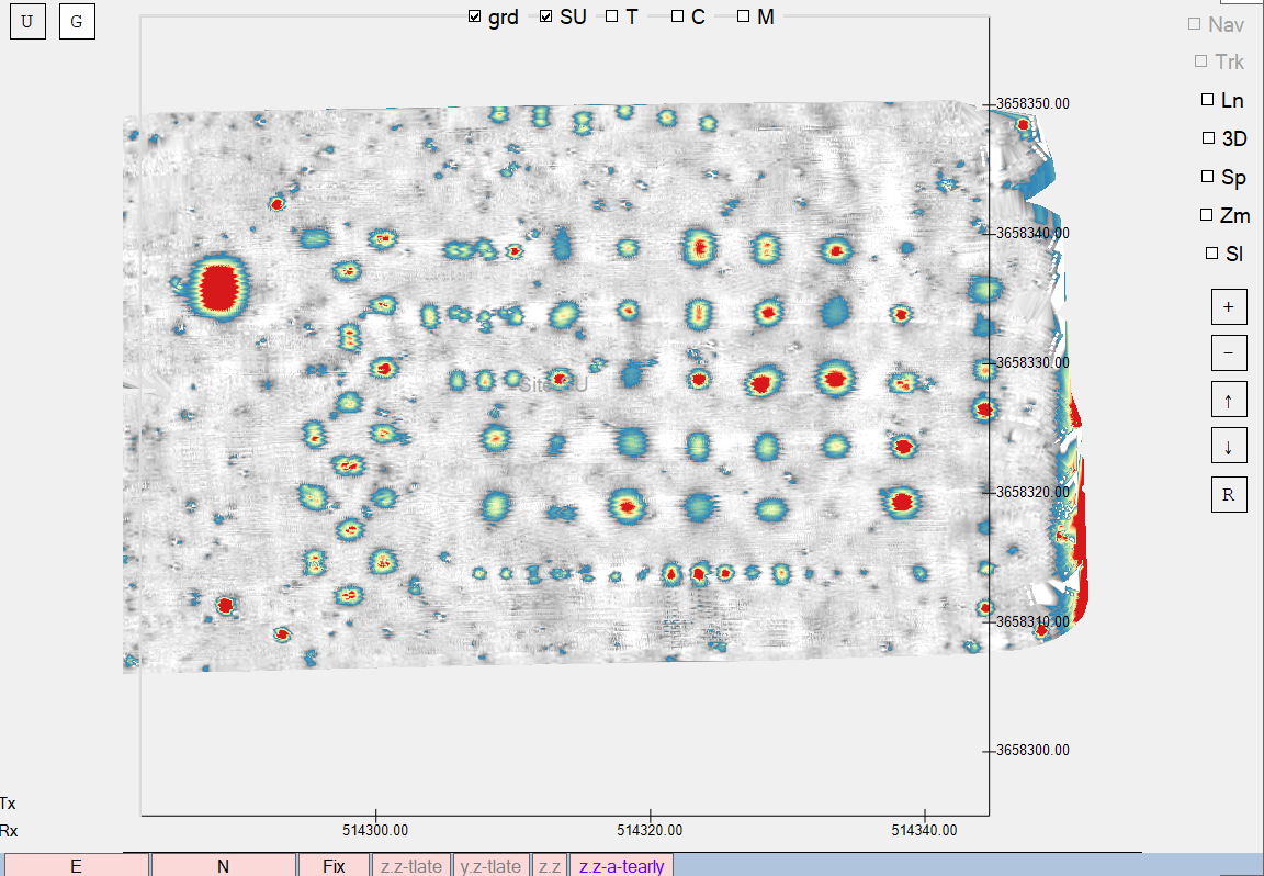
The colour palette and two‑zone threshold are display/visualisation settings only — they change how the data is rendered but not the underlying measurements, detection picks, or inversion results. The gridding method is different: because target picking runs on the permanent grid, the chosen method affects the detection results as well as the appearance (see below).
Gridding method
BTField can build display grids with either of two interpolation methods:
- Weighted distance (default) — the long‑standing BTField gridder.
- Delaunay‑linear — builds a Delaunay triangulation of the data points and interpolates linearly within each triangle. This produces a faithful, artefact‑free surface that honours the data points, which is useful for final/archived survey maps.
The method is chosen with the Use Delaunay gridding checkbox in the Project Settings dialog:
- Unchecked → Weighted distance (default).
- Checked → Delaunay‑linear.
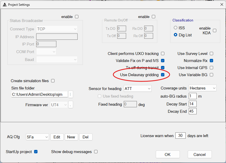
The selection is saved per workspace.
The Set Ranges form
The colours, value range, and transparency of the gridded image are all controlled from the Set Ranges form. Open it by right‑clicking the grid view and choosing Set Ranges.
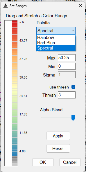
The form’s controls are:
| Control | Purpose |
|---|---|
| Palette | The colour scheme applied to the gridded values (see below). |
| Distribution | How values are mapped onto the palette: normal, linear, or linear % (see below). |
| Max / Min | The upper and lower ends of the mapped value range. In linear % mode these become Max % / Min % and accept percentages (0–100). In normal mode Min is not used. |
| Sigma | Spread of the normal distribution mapping. Enabled only when Distribution is normal. |
| use thresh + Thresh | Optional two‑zone threshold display (see below). |
| Alpha Blend | Transparency of the grid overlay, from fully transparent to fully opaque. |
| Apply | Applies the current settings to the grid without closing the form. |
| Reset | Reverts the palette to its default colours (it does not change the distribution, range, or threshold settings). |
| OK | Applies the settings and closes the form. |
| Cancel | Closes the form. |
Distribution
The Distribution selector controls how the data values are spread across the palette:
- normal — a statistical mapping centred on the data, where Sigma controls how much of the spread is covered. The Min value is not used in this mode.
- linear — a straight linear mapping between the Min and Max values.
- linear % — a linear mapping between two percentiles of the data, entered as Min % and Max % (each between 0 and 100). This is useful for clipping outliers automatically regardless of the absolute data values.
Colour palettes
The Palette dropdown selects the colour scheme mapped across the gridded value range:
| Palette | Description |
|---|---|
| Rainbow | Default. Blue → cyan → green → yellow → red → pink. |
| Red‑Blue | The original BTField blue → red ladder (legacy appearance). |
| Spectral | A QGIS‑style spectral ramp: blue → pale yellow → red. |
The palette can be switched at any time and the grid re‑renders immediately. The selected palette is saved per workspace and becomes the default for newly created grids.
Two‑zone threshold
The use thresh checkbox enables an optional two‑zone display. When enabled, the value range is split at the value entered in the Thresh field:
- Below the threshold — rendered with a white‑to‑dark‑grey ramp, de‑emphasising low values.
- At or above the threshold — rendered with the full colour palette.
This is useful for highlighting a critical boundary — for example, suppressing the visual weight of background‑level data so anomalies above the threshold stand out.